Saturday, 31 January 2015

Mariana Malhão


                      Fig 1,2,3 (above) Mariana Malhão, Little Red Riding Hood

Portuguese Mariana Malhão illustrations remind me of Tove Jansson's Moomin illustration with their mix of sharp characters and elements mixed and overlayed with more amorphous soft shapes. Mariana has used collage paint and digital media to produce this project.

References

Fig 1,2,3, Mariana Malhão, Little Red Riding Hood https://www.behance.net/gallery/17876779/-Little-Red-Riding-Hood-(Capuchinho-Vermelho)-

http://en.wikipedia.org/wiki/Tove_Jansson
https://www.behance.net/gallery/17876779/-Little-Red-Riding-Hood-(Capuchinho-Vermelho)-

Friday, 30 January 2015

But!


This Red Riding Hood springs from a growing frustration at the way the countryside in Britain is managed not for the conservation of wildlife, but increasingly as a playground for the rich to shoot, either wildlife or stock bred for shooting, such as grouse and pheasants.

I am also angry at the way bodies acting on behalf of wildlife being manipulated with funding cuts and sanctions.

In my illustration the forest has been felled, on the stumps the grouse perch and the poor wolf is lead away on a red thread, gagged with a scarlet ribbon.  It is called 'But!'

Thursday, 29 January 2015

Agnieszka Kucharska-Zajkowska


 Fig 1,2 Above Agnieszka Kucharska-Zajkowska Little Red Riding Hood.


                              Fig 3 (above) Agnieszka Kucharska-Zajkowska's leather glove wolf.

Polish artist and designer Agnieszka Kucharska-Zajkowska's version of Little Red Riding Hood is very like a vintage computer game or map, I really like the squiggle of a route which would encourage little fingers to explore and make new routes through the forest. I love her old leather glove wolf it reminds me of the assemblage work of Isidro Ferrer.

References

Fig 1,2 Agnieszka Kucharska-Zajkowska, Little Red Riding Hood  https://www.behance.net/AgiZajkowska
Fig 3 Agnieszka Kucharska-Zajkowska's leather glove wolf. https://www.behance.net/AgiZajkowska

https://www.behance.net/AgiZajkowska
http://agizajkowska.prosite.com/
http://www.isidroferrer.com/

Wednesday, 28 January 2015

Little Red Riding Hood is the Forest

                      Fig 1 (above) Ryuku Uratsuji, Little Red Riding Hood 
Whereas often the wolf is depicted as being part of and as one with the forest. Rarely does Little red blend in with this environment. However here is an illustration by Japanese illustrator Ryuku Uratsuji  where Little Red appears to be happily camouflaged and cloaked in the flora of the forest.

References

Fig 1 Ryuku Uratsuji Little Red 2013 https://www.behance.net/gallery/11928189/Little-Red-Riding-Hood

Tuesday, 27 January 2015

The Wolf is the Forest

                    Fig 1 (above) Alan Dalby 2009 
                             Fig 2 (above) Tamara Diaz 

I am exploring recurring themes or presentations of the characters of Little Red Riding Hood. One idea that is often portrayed is that where the wolf is the forest, at one with the trees. Here are two quite graphic examples by Alan Dalby and Tamara Diaz that merge the forest with the wolf as one harmonious wilderness.


References


Fig 1, Alan Dalby Little Red Riding Hood. http://www.alandalby.co.uk/portfolio/
Fig 2 Tamara Diaz Little Red Riding Hood, http://tamaradiaz.tumblr.com/post/39579148598/caperucita-roja-tinta-china-y-ecoline-carmin


Monday, 26 January 2015

Josefa Galindo

  Fig 1 (above)  Caperucita Roja Josefa Galindo 

A lovely primitively printed Caperucita Roja by Chilean illustrator Josefa Galindo.

"Red Riding Hood is itself. It does not matter whether white or brown, it's a little girl or a very grown-up girl who has black or blonde hair (or as in the case of my artwork that has no hair!). In any part of the world "words red "," hood "," forest "," wolf "  immediately lead us to believe in ... Little Red Riding Hood.
That's why I like to illustrate this story, because it gives me the freedom to do with it what I want and yet it will always remain "Red Riding Hood".
Josefa Galindo

References

http://josefagalindo.blogspot.co.uk/

Sunday, 25 January 2015

Nicholas Stevenson

        Fig 1 (above) Nicholas Stevenson, Sketchbook

Nicholas Stevenson's sketch is very strange, it reminded me of a gaggle of Red Riding Hoods carrying a wolf through the forest which is why I have included it here. The 'dead' tree is very wolf like to with its open mouth at the front, running stance back legs and tail aloft. 
Often I have miss read images and that has inspired other ideas for pictures.

On closer inspection though the dea tree is covered in frogs or babies and it seems that they are red coated soldiers carrying the tree. 
"This piece was inspired by a dream I had, about a regiment of soldiers in red coats, who dig up a tree from an icy pond in a forest, but it's covered in little sleeping creatures frozen to it. They carry the tree to a lake, where the creatures unthaw and swim off in to water out of sight." Nicholas Stevenson 

References 
Fig 1 Nicholas Stevenson, Sketchbook

http://www.nicholasstevenson.com/

Saturday, 24 January 2015

Oscar Sabini


      Fig 1,2 (above) Oscar Sabini Red Riding Hood. 

Oscar Sabini is an Italian illustrator based in Venice. In his Red Riding Hood illustrations he has used collaged newspaper, magazines, letters and oil pastel and pencil. The Red Riding Hood is able to swing her arm as attached with a paper fastener. These illustrations were created for Figure Future of the Salon du Livre Jeunesse, Montreuil, Paris in 2004.

References

Fig 1,2 Oscar Sabini Red Riding Hood. https://www.behance.net/gallery/11627397/LITTLE-RED-RIDING-HOOD
http://www.oscarsabini.com/
http://www.salon-livre-presse-jeunesse.net/

Friday, 23 January 2015

Abrar Abdullateef

                          Fig 1 (above) : Abrar Abdullateef, Little Red Riding Hood

Abrar Abdullateef is an illustrator and surface designer based in Savannah, USA. Abrar's style is minimalistic and geometric. Abra is very interested and inspired by colour and surface pattern.

References

Fig 1: Abrar Abdullateef, Little Red Riding Hood,  http://www.abrarillustrations.com/

http://www.abrarillustrations.com/

Thursday, 22 January 2015

Anna De Leonardis


      Fig 1,2 (above) photography by Anna De Leonardis

Digital photography, shadow and illustration are combined in Anna De Leonardis's interpretation of Little Red Riding Hood; 'Once upon a time' a digital photography project.
This mix of media would be good for creating an animation or theatre piece or graphic poster. Anna De Leonardis is an Italian photographer and product designer.

References

Fig1,2 Anna De Leonardis, 'Once upon at Time' https://www.behance.net/gallery/11492923/Once-upon-a-time

Wednesday, 21 January 2015

Hansel González


   Fig 1,2 (above) details from Hansel González's braille story posters.

Hansel González created a series of fairy tale posters including the tale of Little Red Riding Hood in association with the Caja Mágica Foundation in Venezuela.

Braille Stories 'stories are meant to be felt' is a campaign to invite people to donate Braille books for blind children. We created posters with classic stories translated into Braille and took them to schools where the children could feel these fairy stories that we all read.

References

Fig 1,2, Details from Hansel González's braille story posters https://www.behance.net/gallery/5512977/Stories-meant-to-be-felt

http://www.hanzmade.net/
http://www.lacajamagica.org/
https://www.facebook.com/Hanzmd

Tuesday, 20 January 2015

Arzu Selvitop


Fig 1,2,3,4,5 (above) Little Red Riding Hood by Arzu Selitop

I like the boldness of Arzu Selvitop's design for Little Red Riding Hood, the large clear uninterrupted double spreads of typography and the silhouette style illustration. Arzu Selvitop is a Turkish Graphic designer and illustrator.

References

Fig 1,2,3,4,5 Arzu Selvitop Little Red Riding Hood. https://www.behance.net/graphic_land

Monday, 19 January 2015

Sarah Petersen


     Fig 1(above): Pop Up book by Sarah Petersen 

"This project was one of the most exciting and challenging projects I've tackled thus far. Without knowing how to make a pop-up book, I set off on an a path full or research and trial-and-error mockups to create the finished piece. Each element within the pages was hand cut with an X-ACTO knife and glued carefully in place. Several elements have multiple layers to create interesting dimensions and shadows. I limited the colors to black, white and red, which worked perfectly for the story The Little Red Riding Hood. Thanks to my family (for putting up with the mess), and my friends who gave incredible feedback throughout the process."  Sarah Petersen.
Sarah Petersen is a graphic designer from Salt lake City who graduated from Utah University. This pop up book was her first and feature a kind of visual coding like used in a map key for the characters of the grandmother and Little Red, that you can see in the throat of the wolf.

References:

Fig 1(above): Pop Up book by Sarah Petersen 
https://www.behance.net/gallery/14044385/The-Little-Red-Riding-Hood-pop-up-book

http://sarahpetersen.prosite.com/
https://www.behance.net/sarahpetersen

Sunday, 18 January 2015

Camilla Engman

         Fig 1: The road to perfection by Camilla Engman

This picture was made by Camilla Engman for Chicago Tribune, to illustrate an article about choosing paths, wanting and dreaming. Little Red Riding Hood was used to indicate the bravery needed in this situation and as an icon she is powerful enough on her own and so Camilla could forgo the overtly graphical depiction of the danger, ie: the wolf.

References

Fig 1: The road to perfection https://www.flickr.com/photos/morran/916897104
http://www.camillaengman.com/

Saturday, 17 January 2015

Kilian Schönberger


Todays Little Red Riding Hood is more abstract for it is the vision or allusion of Kilian Schönberger, a German photographer who has been taking landscape pictures in Mid-Europe inspired by fairy tales.
"These photos are inspired by the old fairtytales written by the Brothers Grimm. Therefore I'm searching places throughout Central Europe that echo the mood of those old stories. I think there is a deep longing for tranquil naturalness among people in our techonology-driven environment. Therefore I don't want to show just potrayals of natural scenes - I want to create visually accessible places where the visitor can virtually put his mind at rest and make up his own stories. Possibly this is the real benefit of my work: Resting places for the eyes in an visually overstimulated world." Kilian Schönberger

References

Fig 1,2,3: https://www.facebook.com/KilianSchoenbergerPhotography?fref=photo 

https://www.behance.net/gallery/13139073/BROTHERS-GRIMMS-HOMELAND
https://www.behance.net/gallery/22779389/BROTHERS-GRIMMS-WANDERINGS

Friday, 16 January 2015

Sophia Flores


F

   Fig 1,2,3 (above) extracts from Sophia Flores 'Meta Capercicita & el Lobo
"Little Red Riding Hood is an ambiguous being who can embody not only the figure of an innocent child, but also the wolf figure. "
"This multiplicity is defined as the axis of history, guiding at will. I understand this story as a structure that we all know by heart, and that even if we want change it we already know how it works. So I think we should move away from preconceived ways to motivate us to create our own stories! " Sophia Flores 
Sophia made this comic style illustration for Monos Con Pinsel's Little Red Riding Hood themed month.

References

Fig 1,2,3 Extracts from Sophia Flore'ss 'Meta Capercicita & el Lobo'  https://monosconpincel.wordpress.com/2014/07/21/no-sofia-invitada-no-caperucita/

https://www.facebook.com/no.sofia.5?fref=ts
https://www.flickr.com/photos/lengua_lacia
http://www.lamalafactura.blogspot.co.uk/
https://www.facebook.com/MonosConPincel 

Thursday, 15 January 2015

Ana Batista


Fig 1,2,3 (above) Ana Batista, Capuchinho Vermelho

Ana Batista has produced a very fun, modern and surreal Red Riding Hood from collaged printed papers and magazine cuttings using a similar technique of magazine collage as Lydia Monks lovely elongated limbs and the poor wolf seems to loose his ears.

References:

Fig1,2,3: Ana Batista, Capuchinho Vermelho https://www.behance.net/gallery/630519/Capuchinho-Vermelho
http://www.lydiamonks.com/

Wednesday, 14 January 2015

Kveta Pacovska


                Fig 1,2,3,4 (above) Grimm's  Rotkäppchen, Illustrated by Kveta Pacovska

Grimm's  Rotkäppchen, illustrated by Czechoslovakian illustrator and graphic designer Kveta Pacovska is a very unique vision of Little Red. The illustrations have almost a shredded quality like they have been shaken and torn to pieces by the wolf. But there is also great graphic strength in the pictures.
              Fig 5 (below) Grimm's  Rotkäppchen, Illustrated by Kveta Pacovska

                                                 Fig 6 (Above) Kveta Pacovska

"White and black are not included in the colour spectrum but for methey are colours and mean maximum contrast. And maximum contrast isthe maximum beauty. I am striving for maximum contrast. Red and green.The placing of colours one over the other. It depends on the relation,proportion, rhythm, size, amount and how we placed colours together.It is like music. Each individual tone is beautiful by itself and incertain groupings we create new dimensions, harmony, disharmony,symphonies, operas and books for children."  Kveta Pacovska 

References 

Fig 1,2,3,4,5 Grimm's  Rotkäppchen, Illustrated by Kveta Pacovska. Neugebauer, Michael Edit. Berlin2007 
Fig 6: Kveta Pacovska http://www.kalandraka.com/blog/2009/08/20/kveta-pacovska-en-valladolid-iii/

http://newsgroups.derkeiler.com/Archive/Rec/rec.arts.books.childrens/2008-07/msg00048.html
http://www.minedition.com/en/book/271/

Tuesday, 13 January 2015

Gelli and Liberté

                           Fig 1(above): Liberté by Hazel Terry
I am still playing and exploring with mono prints and gelli prints. I like the abstract uncontrollable nature of them mixed with finer more controlled details.

    Fig 1(above): Liberté (detail) by Hazel Terry
I glimpsed one of the discarded versions of 'Little Red Say's No!' the wrong way up and thought ahhh! Although still in the wolf's jaws this 'Little Red' is much more powerful, and I have called it Liberté.

References 

Fig 1: Liberté by Hazel Terry
Fig 2 Detail of Liberté by Hazel Terry

http://www.sanluisobispo.com/2015/01/11/3436891_people-join-rallies-worldwide.html?rh=1

Monday, 12 January 2015

The Victim

    Fig 1(above) Illustration by comic and graffiti artist Tintanaveia
“The victim who is able to articulate the situation of the victim has ceased to be a victim: he or she has become a threat.” James Baldwin 
                       Fig 2 (above):Angry Little Red Riding Hood Graffiti 

I found this quote today by James Baldwin and I think its sentiment is pivotal in our modern relationship with Little Red Riding Hood, as we play a never ending power game between her and the wolf. Aligning the balance of power according to the context, event, or comment on society.

References

Fig 1: Illustration by comic and graffiti artist Tintanaveia http://www.tintanaveia.com/2010_05_23_archive.html
Fig 2: Angry Red Riding Hood Graffiti https://www.flickr.com/photos/les-enfants-terribles/3262667393/

http://en.wikipedia.org/wiki/James_Baldwin
https://www.goodreads.com/quotes/75199-the-victim-who-is-able-to-articulate-the-situation-of

Sunday, 11 January 2015

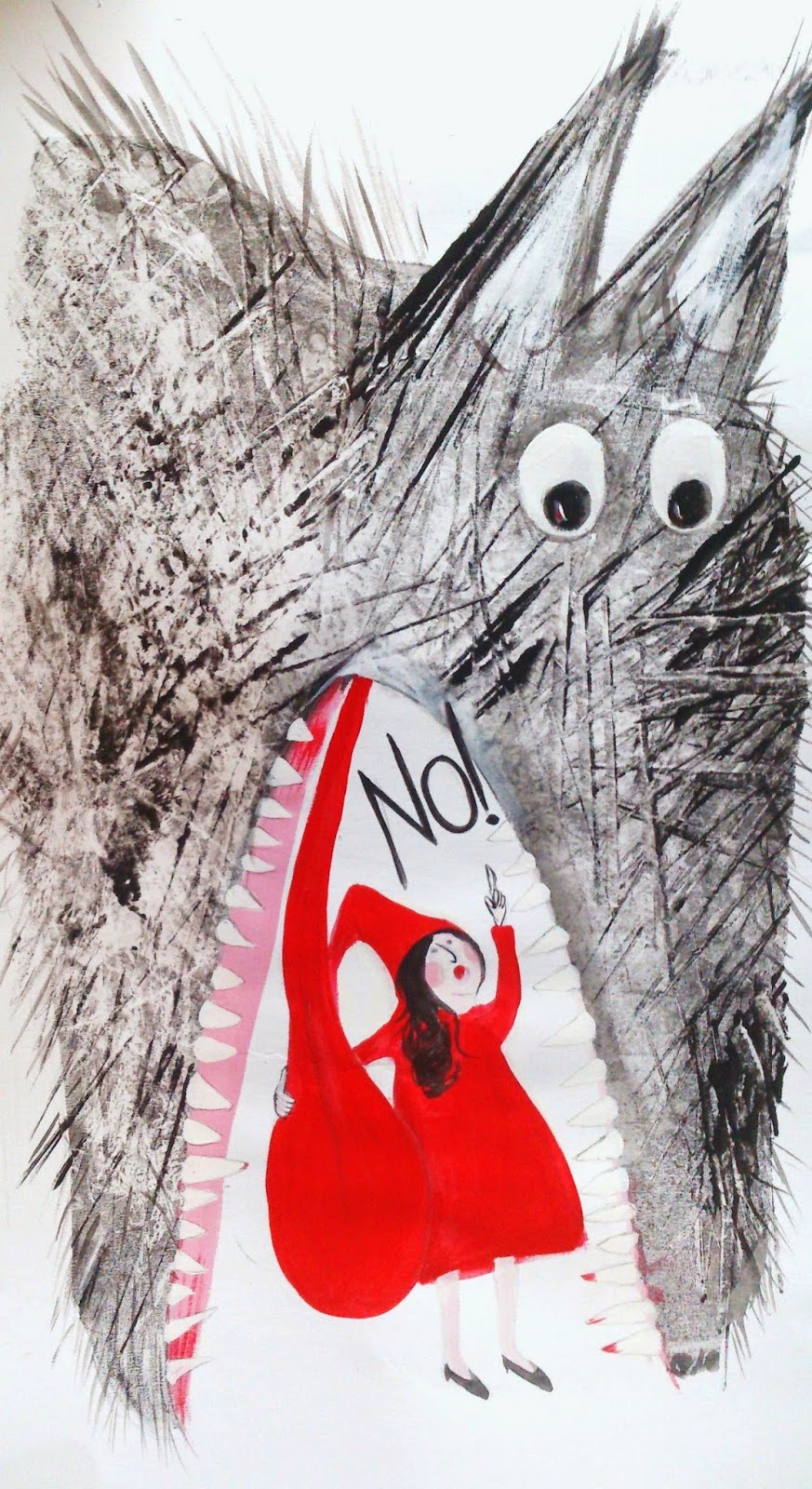
Little Red Say's No!


                                Fig 1: Little Red Say's No! by Hazel Terry

Very late last night I started thinking about the current situation in France and indeed the issue of freedom of speech in many situations, places, and countries around the world.
I have made a Little Red Riding Hood proclaiming No! while holding the wolf's tongue, in a cave of teeth.

This was my sketch and the resulting print/ painting. I made the wolf using a gelli plate print, roughly stenciling out areas that I wanted to paint.

Saturday, 10 January 2015

Matthieu Maudet


                                   Fig 1 (above) Be, do, see, walk, live, laugh... Together by Matthieu Maudet

Matthieu Maudet is a French illustrator from Rennes who is a prolific illustrator and author of children's books and comics. Matthieu attended art school in Nantes, he works on a graphics tablet, or sometimes where works have a black line they are drawn and scanned to be worked up on the computer.

References

Fig 1: Be, do, see, walk, live, laugh... Together by Matthieu Maudet http://matthieumaudet.blogspot.fr/2015/01/blog-post.html 9.1.15

http://www.babelio.com/auteur/Matthieu-Maudet/90047
http://lamareauxmots.com/blog/les-invites-du-mercredi-mathieu-maudet-sandrine-beausandrine-kao-et-valeria-vanguelov/